
Education Network
YCYW Education NetworkOverview
Timeline
13 Months
(Apr 2021 - May 2022)
Team
- Internal Project Manager
- Client Product Managers
- IT Vendors
- Copy Writer
Contribution
- Social Listening
- Information Architecture
- Content Strategy
- UX/UI Design
- Design System
- User Testing

YCYW Education Network approached our agency to rebrand for its 90th anniversary, seeking a consistent look across its 21 schools.
As the sole designer and researcher, I analyzed the vast information of existing sites, focusing on parents of potential students and conducted research with minimal resources to create an actionable content strategy. I also tested information archetecture to build a simplified, aligned strucute that made key information easy to find.
Working closely with the client and IT vendors, I developed a customizable design system for each school. The new brand launched in early 2023, unifying the look for all 21 schools, 8 sub-brands, and the central network site.
Final OutcomeBusiness Problem

Align new branding across all 21 schools to present a unified and modernized online presence.

Outdated design and cluttered structure make school websites hard to navigate and information difficult to find.

- Improve brand image
- Increase student enrollment
Vast Information
Laying the Groundwork for Clarity
We started with a limited understanding of the schools and the information available. My first task was to examine and organize the existing content, which helped the team gain clarity on the network structure and the project’s scope.
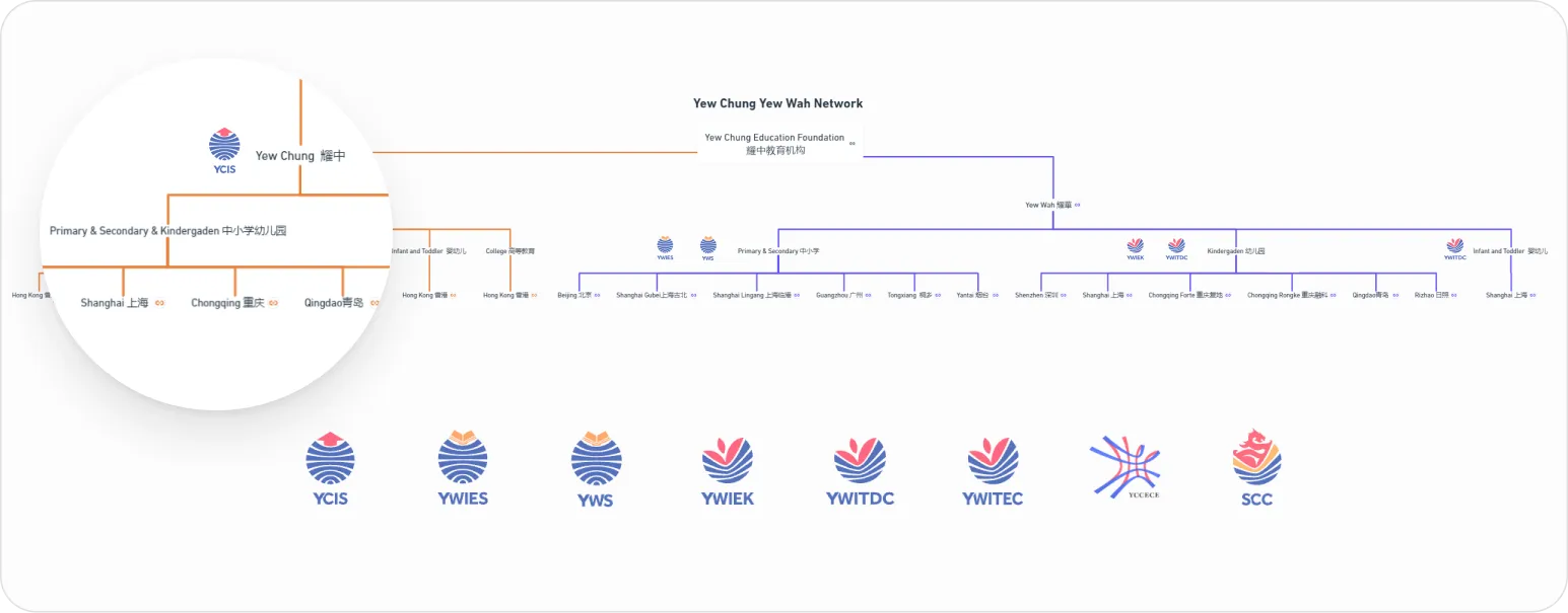
Unorganized Sub-brand Structure
The client’s 21 schools had sub-brands that were poorly categorized, causing confusion. I mapped the structure to clarify the relationships between the schools.
Analyzing and Mapping 200+ Pages Across Schools
I reviewed over 200 pages across all schools, identifying structural similarities and content patterns, while noting differences like inconsistent naming and varying designs across sub-brands.

Impact with Minimal Resources
Strategic Research Approach
I focused on the most cost-effective methods, using secondary research to maximize existing insights within our budget constraints.
Aligning with Parents’ Needs
This approach targeted parents of potential students, shaping a content strategy aligned with their motivations and concerns.
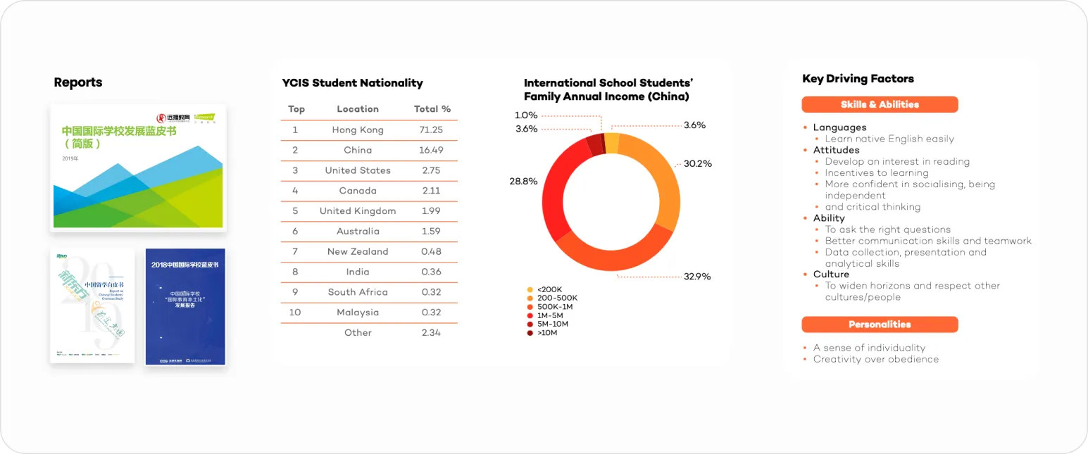
Market Reports
Provided broad insights into parent demographics and preferences, revealing that most parents are middle-class, aged 41-50, in management or ownership roles, and degree holders, predominantly local Chinese.
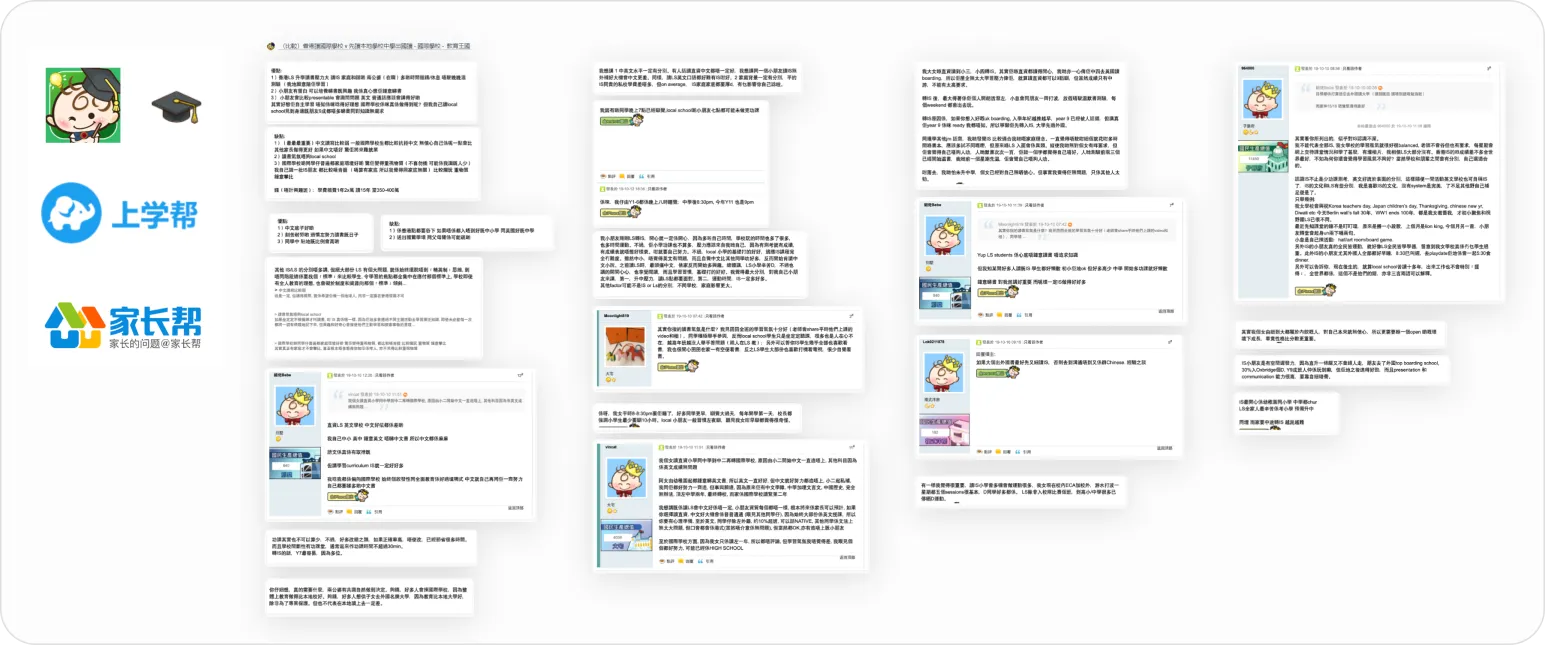
Social Listening
Analyzed discussions on popular forums and social media, we found that parents worried about their children’s Chinese language skills and work ethic but hoped for a less stressful environment focused on reading and sports.
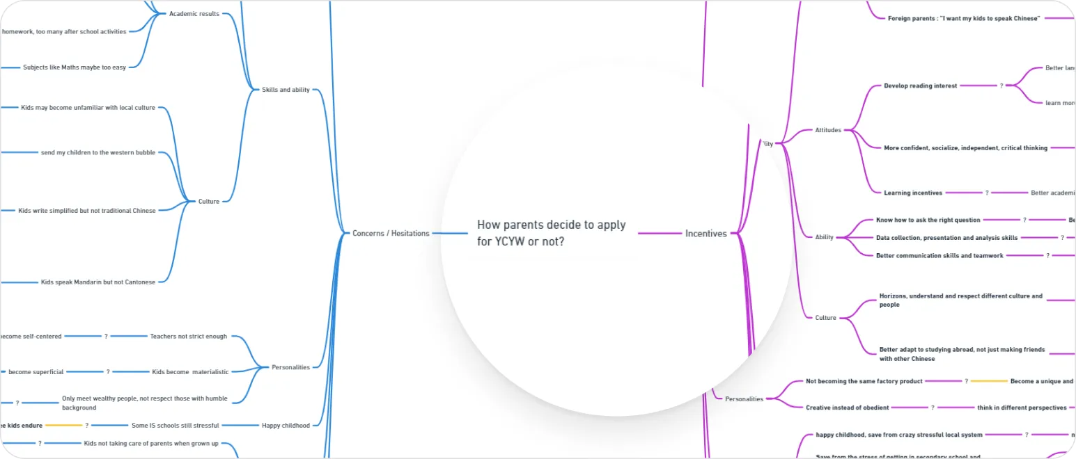
Root Cause Analysis
Integrated insights revealed parental motivations: Incentives—raising happy, successful children; Concerns—underachievement, failure, and societal judgment leading to family disputes.
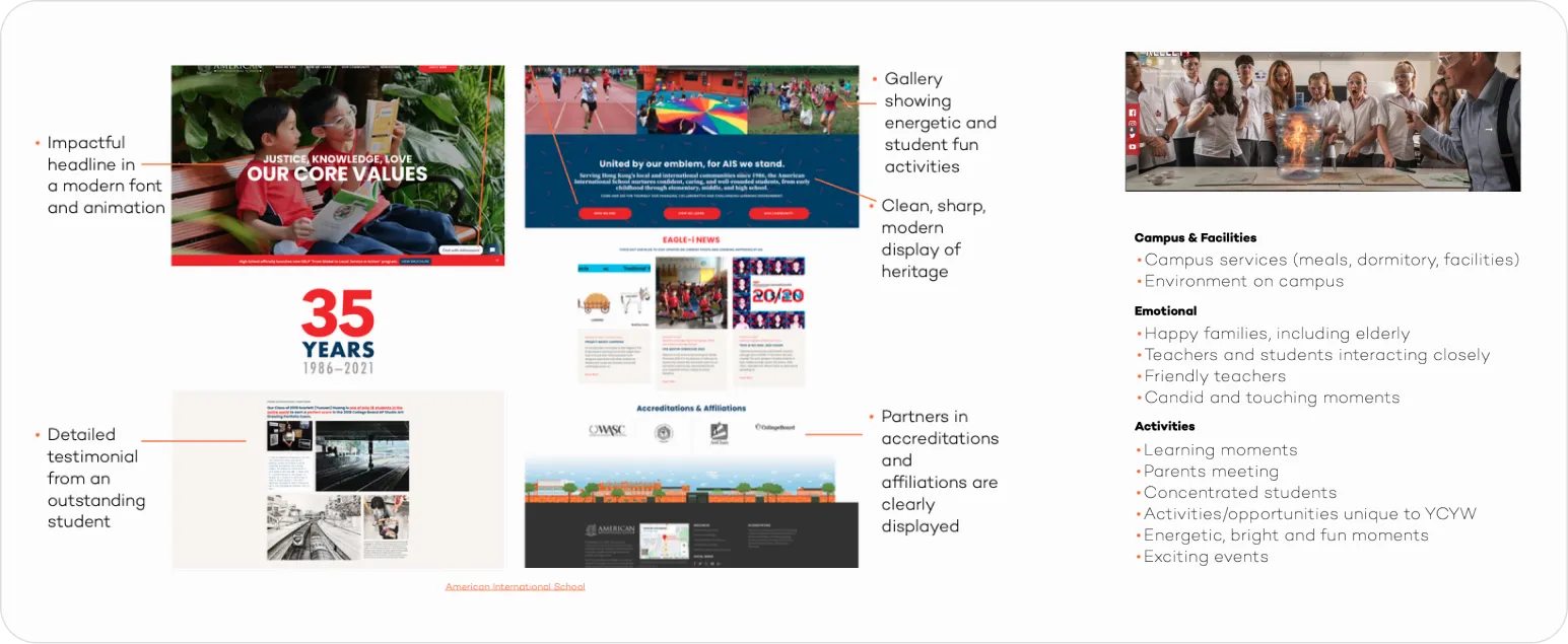
Competitor Analysis
We identified key features that attracted parents to competitor schools, such as galleries of happy students and strong academic results, which reassured parents about their children’s future success.
From Insights to Action
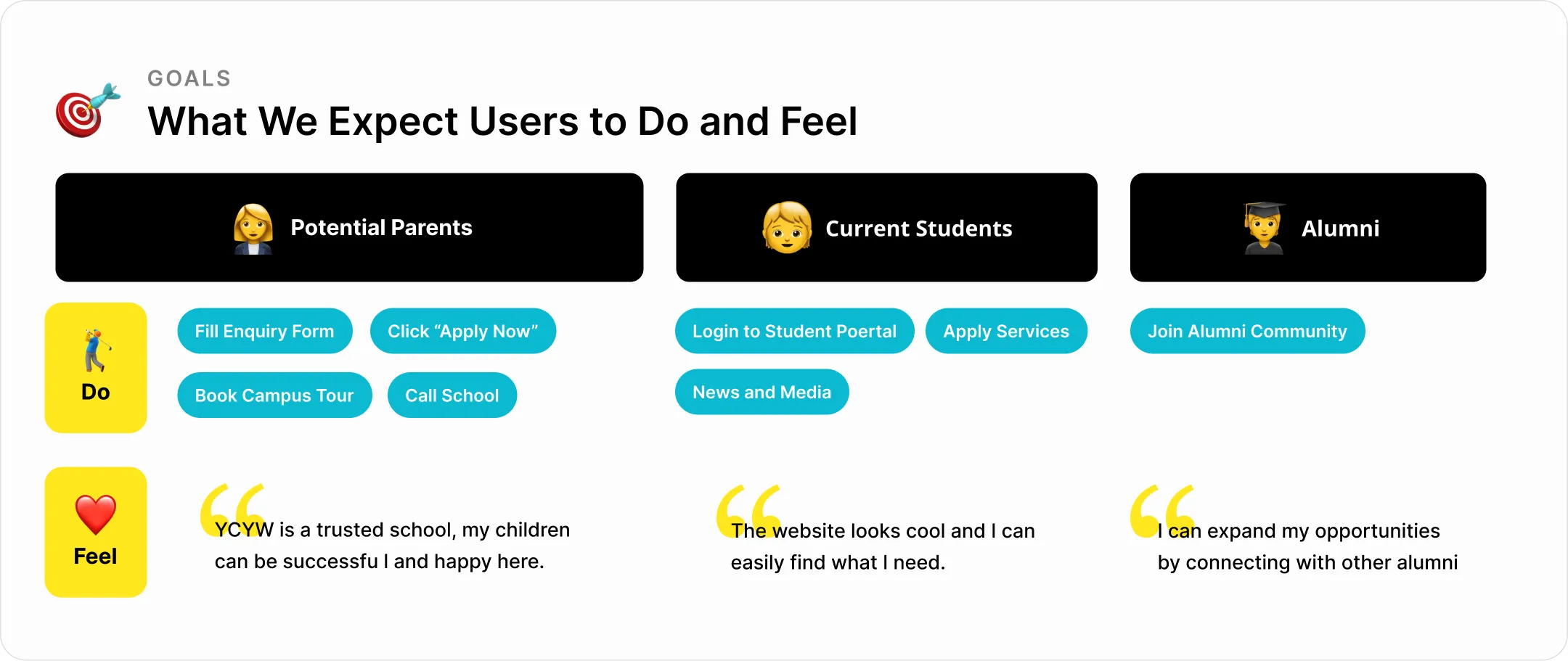
Aligning Content with Business Goals
By understanding parents’ motivations, I crafted a content strategy that aligns user needs with business goals, driving engagement and enrollment.
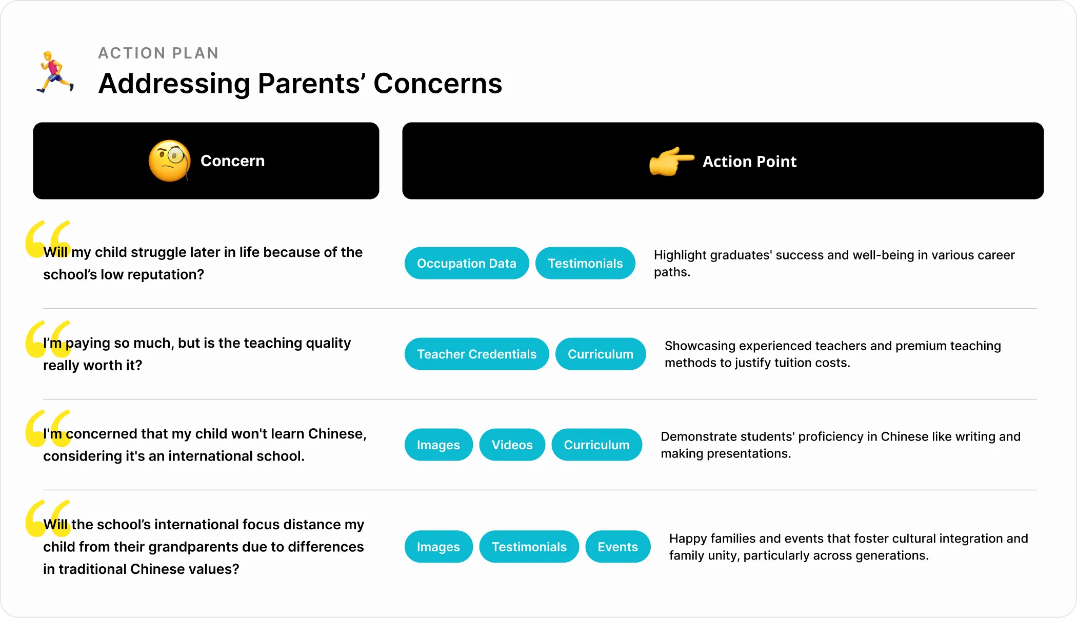
Actionable Game Plan
Each element of the plan, from curated images to specific data points, is designed to alleviate concerns, foster trust, and demonstrate our school’s strengths.
Information Architecture
User Testing to Identify Key Information Needs
I conducted tree test and card sorting to discover navigation issues and learn how users associate information across different sections, ensuring key information was easily accessible for parents, students and alumni.
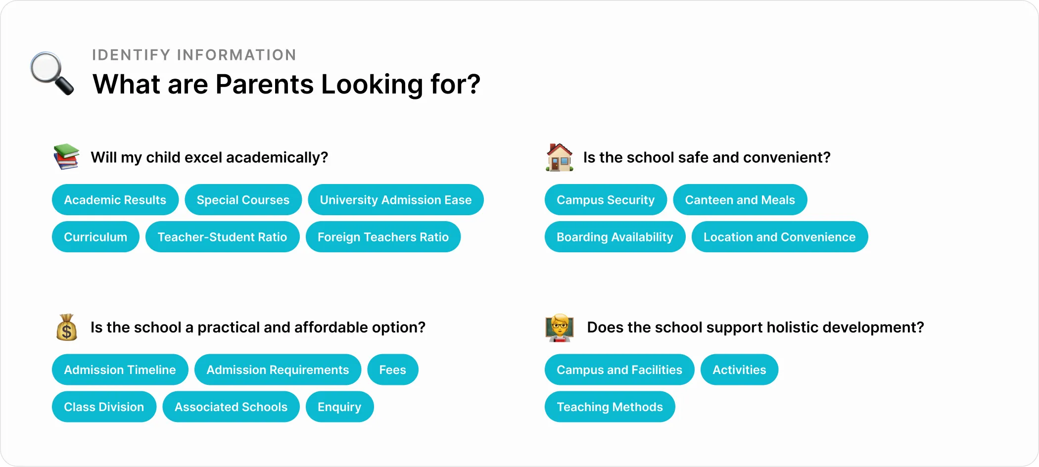
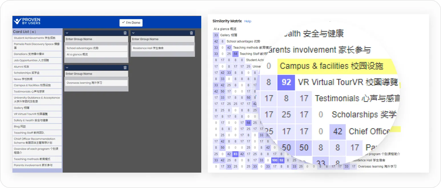
Learning Parents’ Mental Models
Card sorting with 31 users, including 9 parents, revealed how different pages were connected. This helped align page names and ensure intuitive links across sub-brands.
Referencing Familiar Structures
We analyzed site maps from other international schools to help parents quickly locate essential information, like admissions, across different school sites.

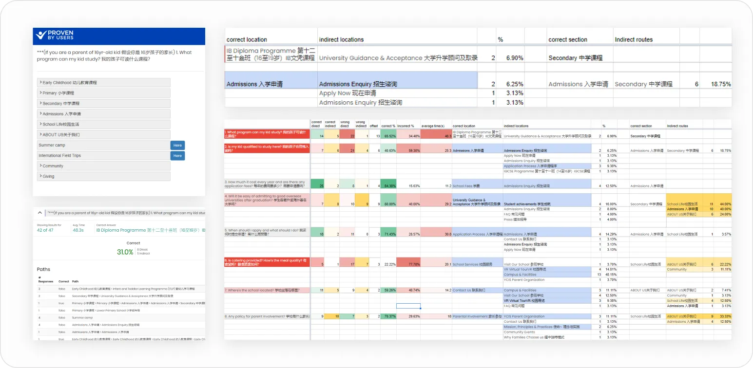
Refining the Sitemap with Tree Testing
After drafting the new sitemap, we conducted tree testing with 23 users. While the success rate wasn’t as high as expected, analyzing the paths of incorrect answers helped us refine the structure.
If most errors pointed to one location, we adjusted the sitemap. If answers were varied, we renamed the page. For cases with 2-3 popular answers, we added links connecting related pages.
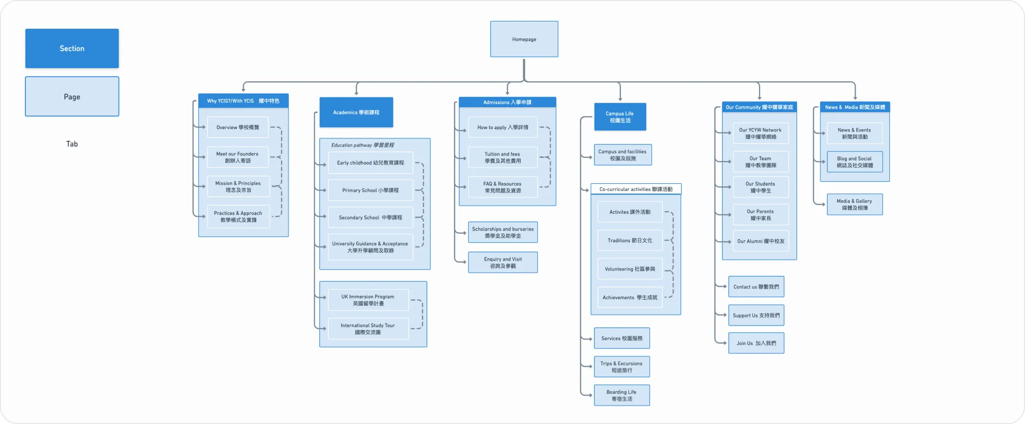
Simplified Structure
We condensed the site from over 40 pages to 18 core pages, using tabs and direct links to simplify access, allowing users to easily locate the information or jump to related content. With the sitemap and the content to put on each page, we moved forward to wireframes and UI design.
Client Collaboration
Exploring UI Design Directions
The client initially had difficulty articulating their preferences for the homepage design. To guide the conversation, we created three distinct versions based on the wireframe content and best practices from other international schools.
Clarifying Client Goals
By presenting options, we encouraged the client to offer specific feedback, like preferring a colored logo on a white header for better readability and branding. Through clarifying questions, we uncovered their focus: a modern, informative design that uses brand colors and subtly highlights the new branding.

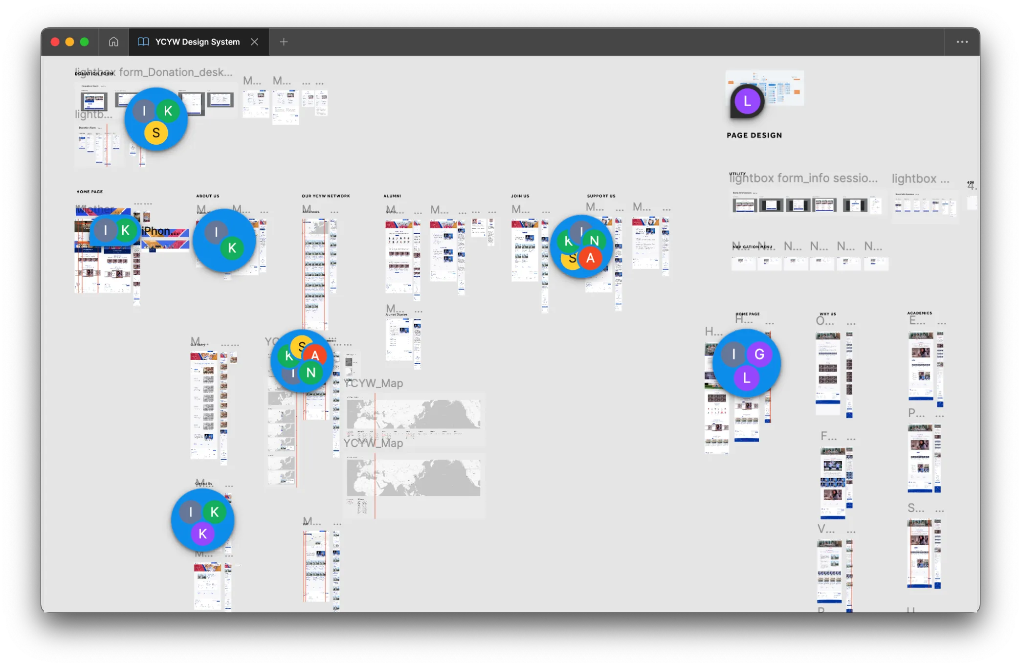
Collaboration
Through multiple revision rounds, we deepened our understanding of their needs while integrating UX suggestions based on user testing, parent feedback, and references from other schools.
This process refined the design to meet both aesthetic and functional goals.
IT Vendors
Solving IT Vendor Challenges
After transitioning to a new IT vendor, I provided a detailed project walkthrough to ensure clear communication and reduce errors. This process involved close collaboration with the developers of individual schools to maintain design consistency while allowing customizations without breaking the site’s structure.
Design System
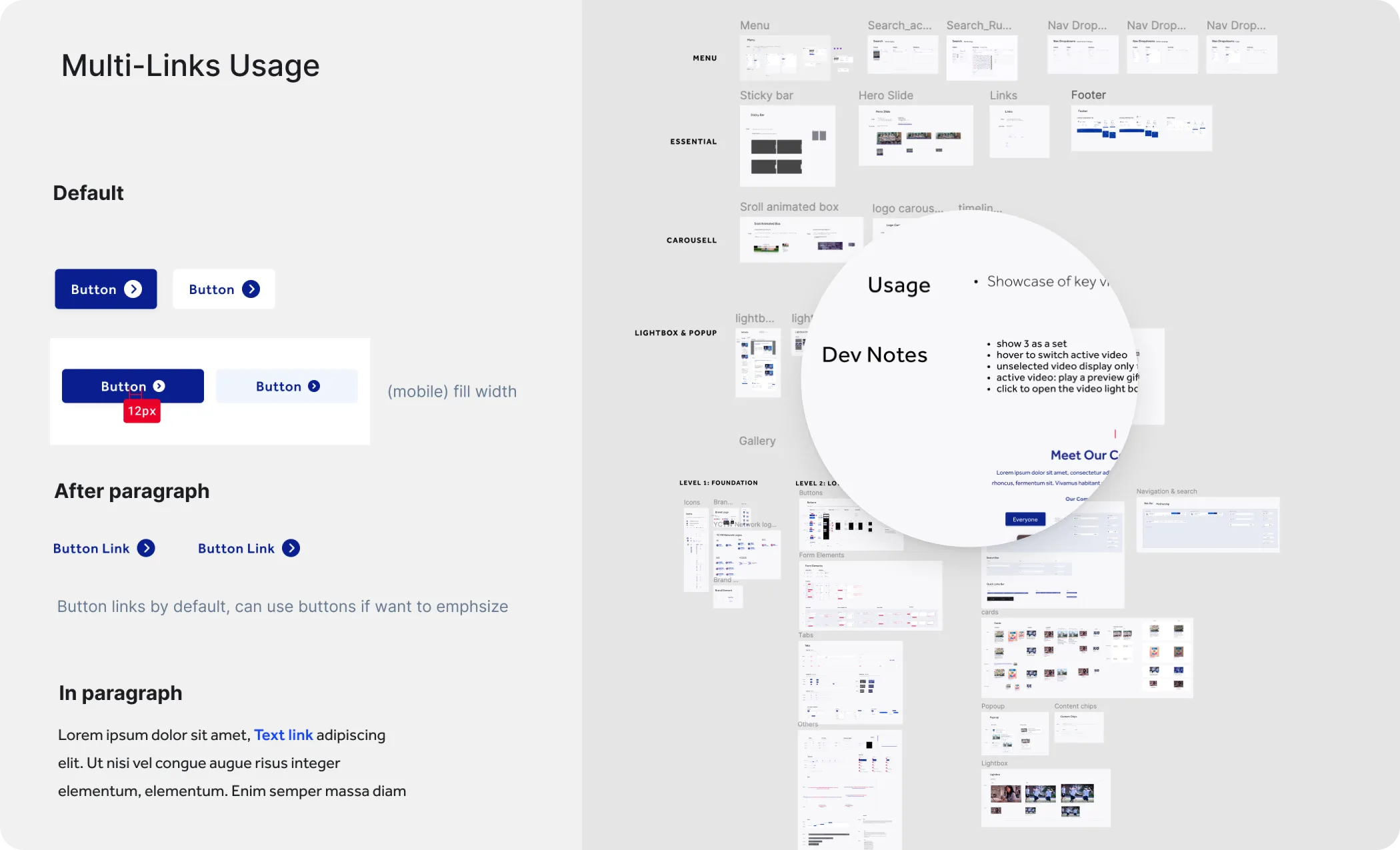
By leveraging my HTML and CSS expertise, I created a design system with customizable components and usage guides. To address concerns like an infinite scroll gallery causing long loading times, I worked closely with the developers to propose alternative solutions that balanced functionality and user experience.
Fianl Outcome
In early 2022, the websites for 21 schools and one central network site were launched for the 90th anniversary celebration. The transition was smooth, with schools more united under a consistent brand identity and improved navigation.


Impact

Increase in Admission Enquiries
More parents showed interest in the schools.

Improved Branding
Unified branding enhanced public perception.

Enhanced Agency Reputation
What I Learned

Actionable Plan
I realized if we can't propose what to do for exact, the research can be a waste of time and resources.

Stakeholder management
Set small milestones with client and dev can greatly minimize the risk of redoing everything and ensure timely delivery.

Love in Complexness
This project required handling of huge amount of information, and I found myself enjoy this a lot. It is very satisfying to make complicated things easy for everyone.