Mobile Cheque Deposit
Bank of China (Hong Kong)Overview
Timeline
11 Months
(Oct 2023 - Sep 2024)
Team
- UX Head
- Business Product Managers
- IT Product Managers
- Scrum Master
- Developers
Contribution
- Industry Benchmarking
- Customer Journeys
- Mockup Design
- Usability Tests
- UAT feedbacks

The bank of China customers can only deposit cheques offline, they wanted to move to digital solution.
As part of the digital transformation team, I led the user experience from user requirement to launch, by validating business logic and implementing the UX design and addressing a key challenge: designing a robust error-handling flow to ensure both a smooth user experience and effective risk management for the bank.
The design was put into production and is now part of the corporate bank app's key offering.
Final OutcomeThe Business Problem

- Cheques can only be deposited offline, causing lunch hour rushes
- Long queues disrupt cash flow for 110,000+ SMB customers

- Allow SMBs to deposit cheques via app by taking photos
- Enable batch deposits in multiple currencies for greater flexibility

- Reduce branch handling costs
- Ensure robust error handling for a smooth user experience and risk management
Validating Business Logic
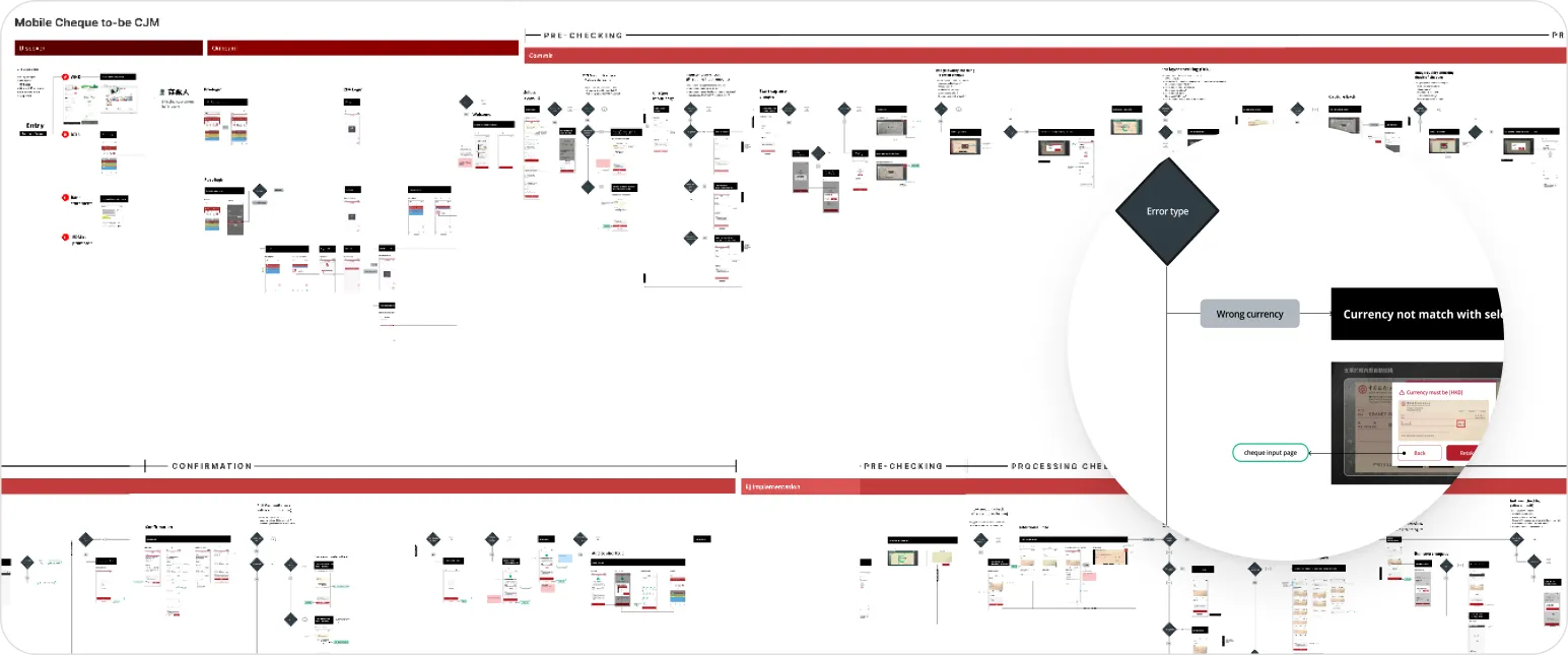
Multiple Scenario-based Checkings
The process included checks like verifying cheque readability and account limits. The complexity increased when users deposited multiple cheques in different currencies at once. I validated business logic by:
- Benchmarking
- Visualizing Business & System Logic
- Identifying and Resolving Gaps
In the end we successfully identified over 20 unhappy flows and collaborated with developers to make sure the logic is robost.

Benchmarking
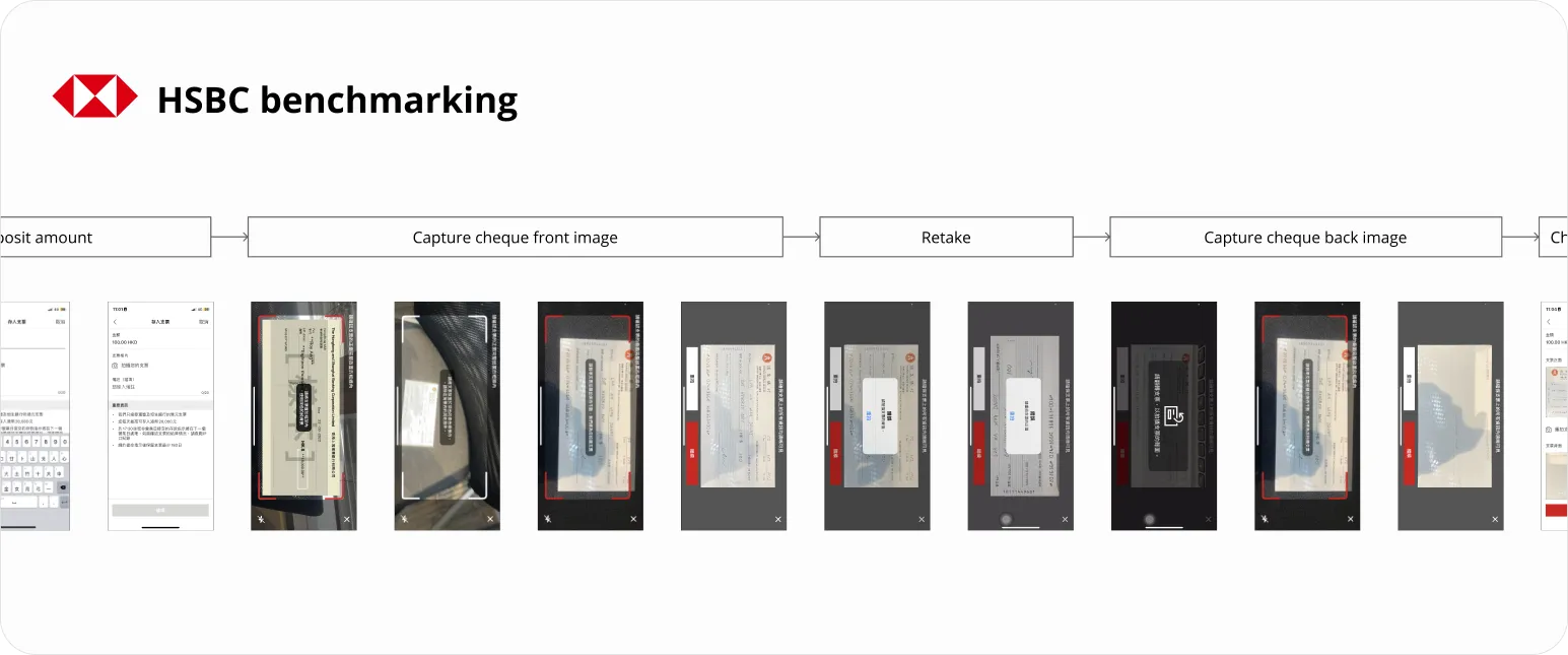
We started by analyzing competitors’ workflows, but their systems only supported single cheques and currencies, offering limited insights for our more complex needs.
Visualizing Business & System Logic
After receiving the business logic from the team, I translated it into clear screenflows. I also mapped out the system integration, showing where data is saved and processed at each stage.


Identifying and Resolving Gaps
We found gaps and missing unhappy flows during the process, so I worked closely with the business team to clarify them, ensuring the user stories remained accurate and aligned.
Implementing UX Design
Error Handling Experience
Key part of the implementation is to help users understanding why their cheques couldn’t be deposited, especially in the case that there are multiple problems.
User Preference for Step-by-Step Error Resolution
We tested several solutions and found that users preferred resolving errors one by one, even if it required more steps, as it provided clarity and reduced confusion.


Help user understand multiple errors
Our Usability tests revealed that displaying errors one by one is less overwhelming for users.
Resolve Errors One by One
Users are guided through each error individually, starting with acknowledging the issue and then choosing to retake or remove the problematic cheques.
Handling Surprises
Quick Solutions Under Constraints
Months after the design was approved by both product managers and developers, we were informed that several elements couldn’t be implemented as designed due to time constraints. To overcome this, I pushed for:
In the end, we proposed actionable workarounds that preserved a solid user experience while meeting the deadline.

Re-solutioning with developers
We quickly organized an emergency meeting with devs to understand their limitations, proposing various alternatives to find feasible solutions.
Prioritized key UI adjustments
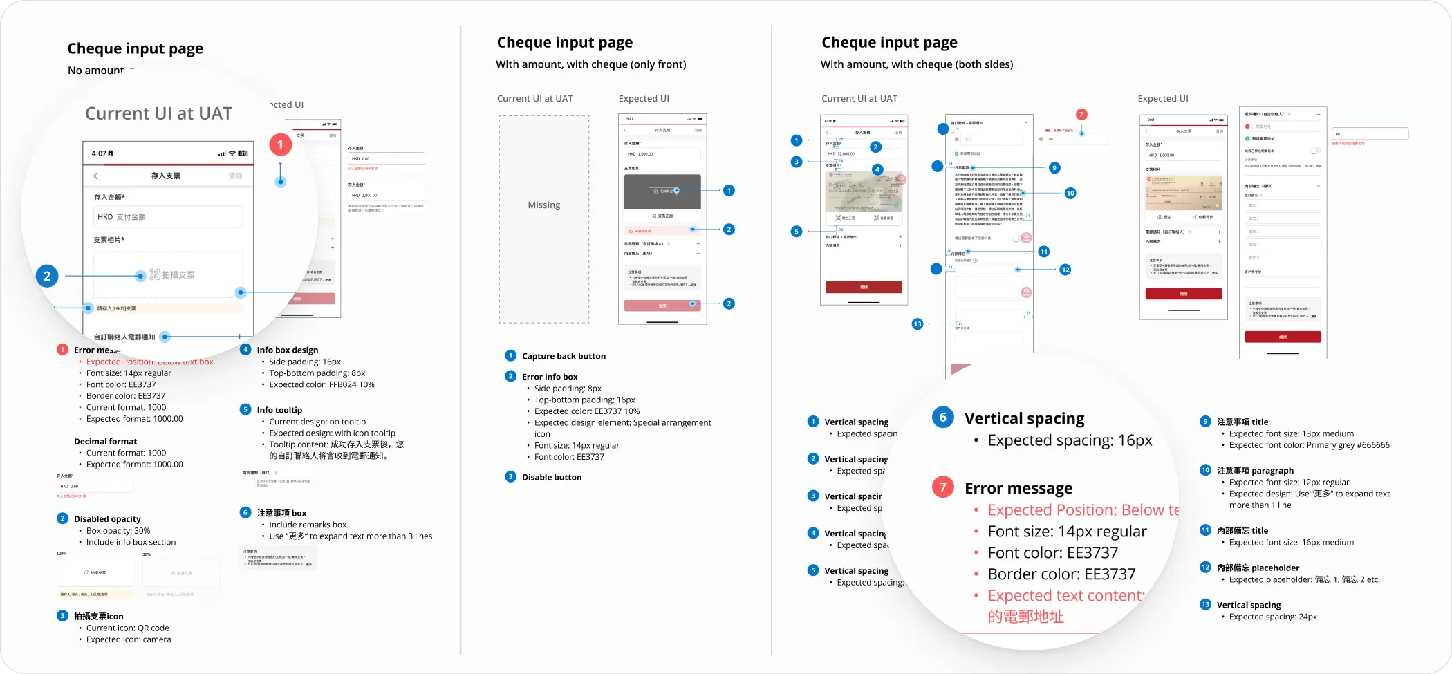
I created a guide categorizing issues by priority: high-priority usability fixes, like confusing icons, and lower-priority aesthetic tweaks, such as spacing.

Final Outcomes
The feature launched in early 2024, positioned as a key offering to attract small business owners to adopt the mobile app, streamlining their cheque deposit process and enhancing overall user convenience.


Impact

75.8% Conversion
Achieved a 75.8% capture success rate, outperforming HSBC’s 60% rate from their product launched two years ago.

43.8% increase in cheque clearance
Following a July update, cheque deposits and clearance rates improved by 43.8%, streamlining the process.

Competitive Edge
Introduced unmatched features like multi-currency and multi-cheque capabilities, drawing customers away from competitors.
What I Learned

Handle Complex Flows
Anticipate and plan for complex user scenarios.

Involve IT Early On
Collaborate with IT from the beginning to align technical and design goals.

Handle Suprises
Develop quick, effective solutions to unexpected challenges.